Apple Liquid Glass First Reactions: A Shiny New Look That No One Can See
By Ashwika Tiwari
Apple Liquid Glass: Apple trotted out iOS 26 at WWDC, trumpeting this as “the biggest redesign since iOS 7.” Enter Liquid Glass —a frothy, translucent UI that mimics your morning latte: flowing, reflective, with blur and rounded corners spanning iPhones, iPads, Macs, Watches, and even the TV. It promised a facelift by making people smile across the ecosystem, except users got a squinty face instead.
Mind you, iOS 26 will officially roll out with the iPhone 17 series in September. It could very well be that the Liquid Glass is meant to look good only on the latest Apple offerings, as is the tradition with the Cupertino giant. The screenshots shared by users online are based on beta builds on current-gen or older iPhone models, which are never the exemplary version of what users will generally experience after an official rollout.
So, consider this report with a pinch of salt.
User Backlash: It’s a Liquid Mess
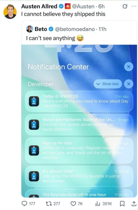
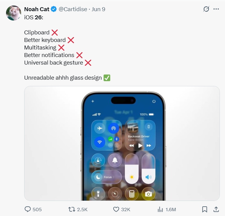
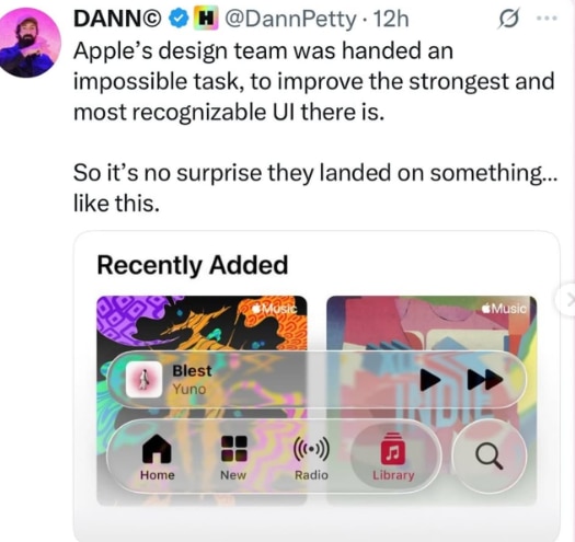
After about 100 words of hype, users hit back with harsh reality:

And there are dozens more. “Please tone it down, make it more milky glass/opaque…” pleaded one frustrated redditor. A critic deadpanned that lock screen notifications look like “hell” —text vanishing into a blur. Another Reddit voice pointed out, “Glass edges produce irrelevant details… opacity produces unwanted details too… it’s a mess.”
What was supposed to be a sleek visual update now feels like staring through a foggy crystal ball.

Experts Chime in To Ask, 'Where’s the Clarity'?
Several leading publications have weighed in, too. Wired called Liquid Glass “beautiful” yet “hard to read”, voicing real concern for those with visual impairments. TechCrunch summed it up as “mixed reviews”, balancing praise for the fluid animations against criticism of legibility. And yes, comparisons to Windows Vista’s Aero are already flying.

Apple’s Response: Accessibility
Apple hasn’t ignored the flak. They secretly added a “Reduce Transparency” toggle under Accessibility > Display & Text Size. But enabling it turns Liquid Glass into just… flat glass. Like getting a facelift and realising someone forgot the mirror.

Some Folks Actually Like It
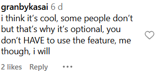
Not everyone is squinting in despair. A handful of users appreciate Liquid Glass as a bold step toward a more dynamic, motion-driven UI. They see promise in how menus fluidly shift, buttons shimmer, and the interface reacts with a newfound sense of depth and responsiveness.

So, What’s the Verdict?
Apple certainly aimed for a sleek, futuristic glow, but ended up launching a translucent glitch show. Liquid Glass dazzles, but only until you need to actually read something. Accessibility toggles exist, but they neuter the effect. The result? A facelift that’s impressive in flash, frustrating in function.
In the end, Apple’s gamble could pay off if it polishes the clarity before launch. Because sparkle is great — until you squint trying to tap it.
technology